0
items
$0
Detecting ‘bursts’ in time series data with Kleinberg’s burst detection algorithm
Awhile ago, I was watching an online course about data visualization and one of the analyses that stuck out to me was called burst detection. Burst detection is a way of identifying periods of time in which some event is unusually popular. In other words, you can use it to identify fads, or “bursts,” of events over time.
I realized that I could use burst detection to answer a long-standing curiosity of mine: what does a timeline of fMRI trends look like? What kind of fads have popped up in the short history of fMRI and what topics are currently popular? I have an intuitive sense of what topics were popular throughout fMRI's short history, but I like the idea of using burst detection to identify trends in the fMRI literature in a data-driven way.
The video that introduced me to the idea of burst detection used software that I didn’t have access to, but I found the paper that the analysis is based on, titled “Bursty and Hierarchical Structure in Streams”, by Kleinberg (2002). I implemented the bursting algorithm in Python, which you can access on Pypi or Github. The functions that I wrote apply to the algorithms described in the second half of the paper, which involve detecting bursts in discrete bundles of events. There are already packages in Python and R that implement the algorithms in the first half of the paper, which involve detecting bursts in continuous streams of events.
In this blog post, I will describe the rationale behind burst detection and describe how to implement it. In subsequent blog posts, I will apply the algorithm to real data. I’ve already found “bursts” in the fMRI literature and I’d like to also detect bursts in my Googling history and in news archives.
RATIONALE OF BURST DETECTION
Kleinberg’s burst detection algorithm identifies time periods in which a target event is uncharacteristically frequent, or “bursty.” You can use burst detection to detect bursts in a continuous stream of events (like receiving emails) or in discrete batches of events (like poster titles submitted to an annual conference). I focused on detecting bursts in discrete batches of events, since scientific articles are often published in batches in each journal issue.
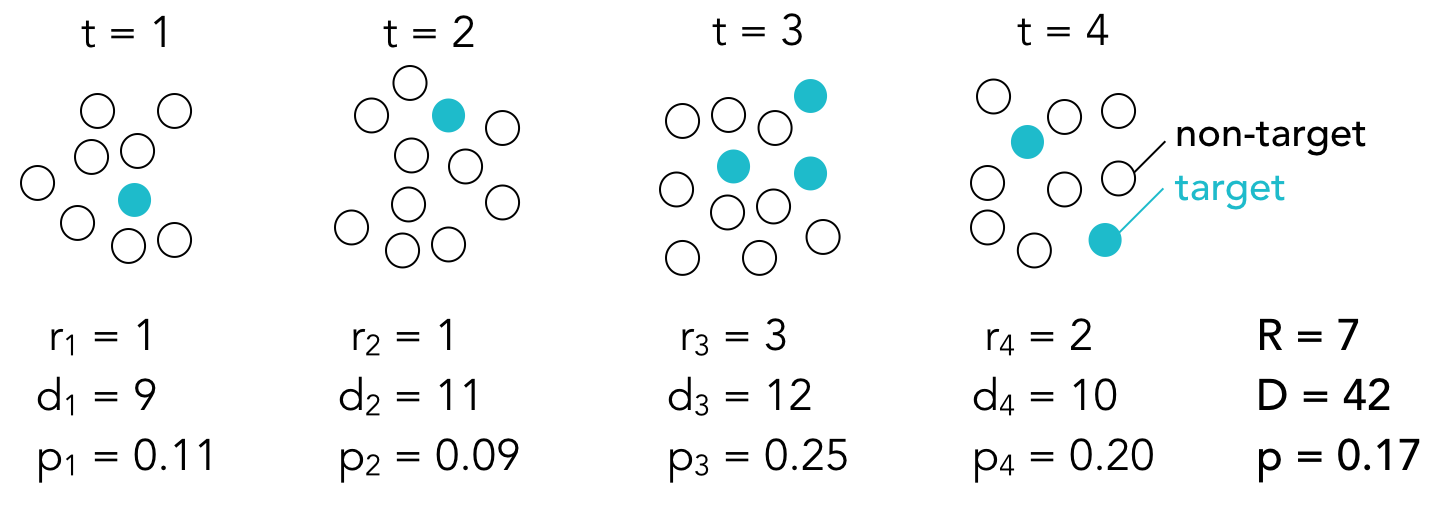
Here’s the basic idea: a set of events, consisting of both target and non-target events, is observed at each time point t. If we use the poster title example, target events may consist of poster titles that include the word connectivity and non-target events may consist of all other poster titles (that is, all the poster titles that do not include the word connectivity). The total number of events at each time point is denoted by d and the number of target events is denoted by r. The proportion p of target events at each time point is equal to r/d.
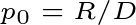
Burst detection assumes that there are multiple states (or modes) that correspond to different probabilities of target events. Some states have high target probabilities, some states have very low target probabilities, and others have moderate target probabilities. If we assume that there are only two possible states, then we can think of the state with the lower probability as the baseline state and the state with the higher probability as the “bursty” state. The baseline probability is equal to the overall proportion of target events:
where R is the sum of target events at each time point and D is the sum of total events at each time point.
The bursty state probability is equal to the baseline probability multiplied by some constant s.You choose what to make s. If s is large, the probability of target events needs to be high to enter a bursty state.

When you are in a given state, you expect that, on average, the target events will occur with the probability associated with that state. Sometimes the proportion of target events will be higher than expected and sometimes it will be lower than expected due to random noise. The purpose of burst detection is to predict what state the system is in based on the sequence of observed proportions. In other words, given the observed proportions of target events in each batch of events, the burst detection algorithm will determine when the system was likely in a baseline state and when it was likely in a bursty state.
Determining which state the system is in at any given time depends on two things:
1. The goodness of fit between the observed proportion and the expected probability of each state. The closer the observed proportion is to the expected probability of a state, the more likely the system is in that state. Goodness of fit is denoted by sigma, which is defined as:

where i corresponds to the state (in a two-state system, i=0 corresponds to the baseline state and i=1 corresponds to the bursty state).
2. The difficulty of transitioning from the previous state to the next state. There’s a cost associated with entering a higher state, but no cost associated with staying in the same state or returning to a lower state. The transition cost, denoted by tau, therefore equals zero when transitioning to a lower state or staying in the same state. When entering a higher state, the transition cost is defined as:

where n is the number of time points and gamma is the difficulty of transitioning into higher states. You can choose the value of gamma. Higher values make it harder to transition into a more bursty state.
The total cost of transitioning from one state to another is equal to the sum of the two functions above. With the cost function in hand, we can find the optimal state sequence, q. The optimal state sequence is the sequence of states that minimizes the total cost or, in other words, the sequence that best explains the observed proportions. We find q with the Viterbi algorithm. The basic idea is simple: first, we calculate the cost of being in each state at t=1 and we choose the state with the minimum cost; then we calculate the cost of transitioning from our current state in t=1 to each possible state at t=2, and again we choose the state with the minimum cost. We repeat these steps for all time points to get a state sequence that minimizes the cost function.
The state sequence tells you when the system was in a heightened, or bursty, state. We can repeat these steps for different target events (for example, different words in poster titles) to build a timeline of what events were popular over time.
The strength, or weight, of a burst (that begins at time point t1 and ends at time point t2) can be estimated with the following function:

This equation simply tells us how much the fit cost is reduced when we are in a bursty state vs. the baseline state during the burst period. The more the fit cost is reduced, the stronger the burst and the greater the weight.
IMPLEMENTATION WITH SIMULATED DATA
I implemented the burst detection algorithm in Python and created a time series with artificial bursts to test the code. The time series consisted of 1000 time points and bursts were added from t=200 to t=399 and t=700 to t=799. Here’s what the raw time course looked like:

Setting s to 2 and gamma to 1, the algorithm identified one burst from t=701 to t=800 and 32 small bursts between t=200 and t=395. What does this tell us? The burst detection algorithm can easily identify periods in which the proportion of target events is much higher than usual, but it has a harder time identifying weaker bursts, especially in the presence of noise. I repeated the analysis using different values for s and gamma to get a sense of how these values affect the burst detection. Here, the bursts from each analysis (represented with blue bars) are plotted on the same timeline:

You can think of s as the distance between states. When s is small, the difference between the states’ expected probabilities is also small. When we increase s while holding gamma constant (as shown in the first four timelines), we get shorter bursts. Essentially, we’re breaking up larger bursts into smaller bursts since we’re increasing the threshold that the observed proportions need to meet in order to be considered in a burst. Since the time course is so noisy, some timepoints in the artificial burst periods do not meet that threshold and fewer and fewer time points meet the threshold as s increases.
Gamma determines how difficult it is to enter a higher state. Since there is no cost associated with staying in the same state or returning to a lower state, changing gamma should only affect the beginnings of bursts and not their endings. You can see that as gamma increases, we get fewer and shorter bursts since, again, we are making it more difficult to enter a bursty state. It’s not obvious from the timeline, but if you look at the start and end points of the burst that survived all of the gamma settings, you find that the burst ends at t=281 regardless of gamma. However, it begins at t=274 when gamma is 0.5, at t=279 when gamma is 1, and t=280 when gamma is 2 or 3.
As these plots illustrate, the burst detection algorithm is highly sensitive to noise. To reduce the effects of noise, we can temporally smooth the time course. Here’s what the bursts look like when we use a smoothing window with a width of 5 time points:

We get fewer, longer bursts since the proportions at each time point are less noisy. For this data, s=1.5 and gamma=1 identified both bursts.
Hopefully it’s obvious that the results of burst detection depend heavily on the parameters you choose. It may not be the best method to use if you care about the specific start and end points of bursts (or the number of bursts), but it’s a useful method if you’re interested in general trends in a large dataset over time.
I really recommend reading Kleinberg’s paper for a more detailed (and sophisticated) explanation of burst detection. If you’re interested in seeing the code I wrote to generate the figures in this post, you can check out my iPython notebook. The burst_detection package is my first, so please let me know if you run into any problems or if you notice any errors.
As I mentioned at the beginning of the post, I already applied the burst detection algorithm to the fMRI literature to identify trends in fMRI over the last 20 years. I’ll try to post that analysis soon. I have a few more project ideas after that, including finding trends in my Google search history, finding trends in rap lyrics, and finding trends in news articles. Let me know if you know of any interesting datasets that are amenable to burst detection or if you end up using the burst_detection package yourself.